It is true that these days, social media platforms have earned a lot of popularity. Yet, the fact is that they are the best way a photographer can showcase his work online. Creating a photography website will help you display your pictures exactly how you want them to be displayed in front of people. You will not have to pertain to size, quality or design limits. Moreover, it will also help you to reach a much wider audience and attract the attention of new clients. Make sure that you get the best Web Design Teddington.
We have designed a photography website, and here we will discuss with you in detail about our approach:
We had set apparent goals.
Before we started creating a website, the first thing that we did was set up a clear goal. We tried understanding what our client wanted the website to do for his business. Is it that you want to attract the attention of more clients? A bit of both? This helped us in choosing the right image, and we were also able to organize them better for the site. We have used the same website to display the different types of photography. But we ensured that we drew a clear distinction between the different themes. We have also created multiple galleries.
We have included the best photographs of our clients.
We first decided on the collection of the works that our client would want to be displayed on the website. You should remember here that unlike your Instagram account, where you have all your photographs displayed, you should only have your best work on your website. It should have representative pieces of each category. We made sure that we chose quality over quantity. We did not include more than 25 pictures in the gallery section. It is highly recommended that you should ensure that your visitors leave the site curious rather than being overfed.
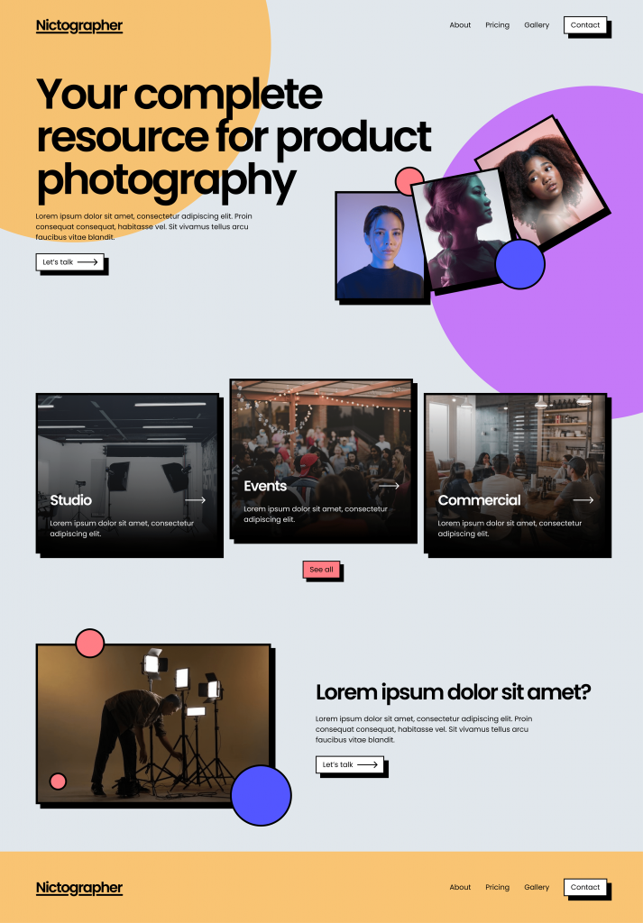
We designed a layout for the website.
The layout is a very important element of a website. Therefore through the photography website, we ensure that the best images of our clients are at the centre to get the attention they deserve. We, therefore, went for a colour scheme that is highly refined and there is a minimal amount of hues. We used the white colour on the background so that your design stands out. We selected a display that would fit the dominant format of the pictures. You can opt for long scrolling in case you take several vertical photos and grids for the horizontal ones.
Choose the perfect template.
We designed some professional photography design templates and selected one from among those. These have been created with the specific needs of each photography genre; therefore, some of the sections and tools are already included in the genre. These templates are free and customizable, from the header to the footer. The website should be able to tell your story from your perspective.
Even if you plan to create a photography website from scratch, you can browse through our best photography website templates. This will help you to get a good idea.
Add the right pages
Then we created the architecture of your photography website. This included the pages that our client wanted to include on the website. We also decided on the place where it would be located. We, however, included only a few pages. Instead, we focused on the must-haves.
Homepage
This is the page where you put yourself and describe what you do. We included both written as well as visual content here. This is because, apart from visuals, it is also essential for the visitor to go through some narratives. For example, if you display a beautiful landscape image on your homepage, you also have to use words that will make it clear that this is a website relating to photography and that it is not a travel agency. Therefore, we have created a large photography logo that is legible on the homepage, and the visitors know exactly who you are, what you do, and where you are located.
Moreover, we have also included a navigation menu on the website so that the visitors can easily transition from one page to the next and find the content they want. Depending on the website’s style, you can choose a navigation bar at the header of your site, or if you want, you can also use a collapsed hamburger menu that will provide you with more room for visual content.
Gallery
This is the core of your website, where visitors can check out the different photographs. Therefore, you need to choose carefully the online tool you will use to build this. We used a gallery that would allow our clients to have complete control over their pictures and how they would want to showcase them.
This way, you will be able to set the quality and sharpness for every image. This will ensure that the visitors see each of these images exactly how they have planned. Moreover, we also selected a customizable layout.
The Pro Gallery also comes up with several options to help enhance or promote the photos. We also protected these photos by preventing any downloads. Apart from this, we have also added a share button to help you spread your talent across all social channels. Moreover, the Gallery allows you to upload videos and text. This adds a greater variety to the final result.
About Me Page
This is the page where people come to know who you are. Indeed, you need not mention here the day your uncle from London offered you your first disposable camera. Your visitors would rather be more interested in the philosophy of art and life. It would be best if you also let them know about your technique and also the place from where you draw inspiration. It is always good to use first-person over the third. This makes things a little more intimate. The readers will be more interested in getting in touch with you. We also included a picture of our client along with his CV. This will show who you are and will also amplify your brand. This is one of the most important things you need to do when creating a photography website.
Showcasing the work to the client
Like most photographers, our client also does a lot of work on commission. People feel much more confident when they see the work that you have done for your previous clients. Therefore, we added and displayed the previous projects of our clients on the photography website after taking permission from our client. We created stand-alone album sites for our customers. The photos he had captured were displayed in a stunning layout and were branded with the required information.
Contact information
We also ensured that our customer’s potential clients can get in touch with him by providing some of the most basic contact information on the website. These details included his name, email address, and phone number in the website’s footer. If you want, you can also create a dedicated contact page. This will ensure that the visitors will get all vital information. A contact form is also a great addition that you might like to consider. This will allow the visitors to message you directly through your website.
We also added an app that will have the updated calendar of our clients. This way, the potential clients know when he is available for a shoot. There is also an option to pay and book online. Therefore, he will no longer have to answer calls and reply to emails. His hands will be free to take beautiful pictures.
We also provided an option where the user can connect to the social media channels on our client’s website.
This will allow the user to share the photos of our client on Instagram and other social networking channels. There are more than 500 million daily users on Instagram alone. Social media is the easiest and the most inexpensive way that will help you to get your name out there and will also help you to attract new clients. We ensured that the social bar is visible on the website and will have a link to all your profiles. The visitors will be able to locate it just within a few seconds. We recommend you display the bar either in the website’s header, the menu, the footer or as an anchor on the side. You can also enable the sharing option in the Pro Gallery. Nothing can build your reputation more than sharing your work across several social media platforms. We also put the website’s domain name at the top of each social profile to ensure that the social fans return to the professional site.
We made the site easy to navigate.
This is an essential thing for all photography websites. If the website is not easy to navigate and the visitors tend to feel lost even for just a second, they will, in all probability, close the tab and will never come back. To avoid this, we ensured that the website had a straightforward way to move to another page or even return to the homepage. We have kept a fixed menu on the whole site that will allow visitors to navigate easily from one page to another.
It is crucial to find the right tone.
The visitors will, in all probability, reach your website with a predefined idea about what they expect from your website. In most cases, photographers who work within the same genre or style follow similar guidelines on their portfolios. Therefore, we researched before settling on a layout or colour scheme. This way, you will be able to understand the visitors better and see how you can make the most out of every element.
We added some movement to the website.
Motion has been regarded as one of the biggest photography website design trends. Therefore, we added some short video clips to the main Gallery and used a video on the homepage. This significantly improved the engagement of the site. If you want, you can also add some movement to the site by incorporating specific interactive hover effects and subtle animations on the images and the website’s text.
Conclusion
We have created a website that is a beautiful combination of composition and aesthetics. We have thus been able to create a beautiful online portfolio.