We see every project as an opportunity to discover new vistas in our work. Being presented with an opportunity to design a dilletante website called the Green Shelob was one of the most interesting opportunities that we had in recent years.
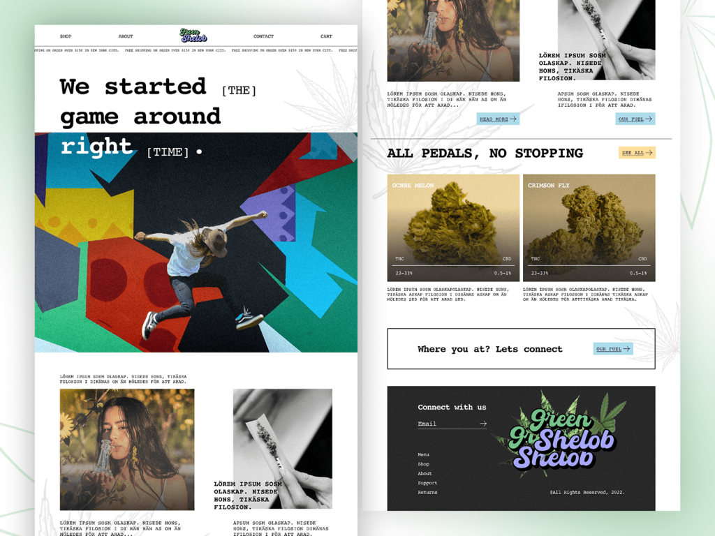
Starts with Shop, About, Green Shelob, Contact, Cart
Each client needs a unique path for their web promotions. The name Green Shelob is about the empowerment of women in a very modern and libertine way. The Green Shelob to many is a symbol of a mighty, liberated woman.
She has a certain cult following. There may be many website visitors who would not know her before visiting the site. Therefore, to make the website’s intention clear to all visitors, we got straight to the point in the first line. We put links from left to right with the words “Shop”, “About”, the logo of “Green Shelob”, “Contact”, and “ Cart” in the first line itself. We communicated that it is a shopping site and offers “Green Shelob” branded products. Make sure you get a good Web Design Woking.
The creation of the Green Shelob logo
The mythical Green Shelob is associated with a wild feminine form, a spider with an insatiable appetite etc. The colour combination for the logo was primarily green and light blue. Green is associated with nature, mother earth etc. while the colour blue is associated with the open skies. Therefore, the logo was meant to represent a very powerful form of nature in a very unorthodox and opposite way. We see the greenery under the blue skies. However, in the “Green Shelob” logo, the greenery is on top while the blue skies are at the bottom.
The tagline, “We started the game around (the) right (time)”
The Green Shelob brand is about feminine power in a very unorthodox and almost opposite way. Therefore, a kind of double-meaning tagline was used. If the words outside the brackets, “We started the game around right” are read, it comes across as a bold statement in the form of a rhetorical question which refers to the wild, powerful feminity which can be a game changer.
If the tagline is read along with the words in the bracket, “We started the game around the right time”, it sort of implies a statement that the time for the powerful, liberated feminine power has come.
The Hero image of Multiple coloured boxes and a Woman taking a Jump
Multiple colours have been used by many corporates in modern times to represent the freshness of the thinking process, the introduction of a new paradigm of thinking etc. The red color represents excitement. The woman in the picture is taking a leap of faith into the particular paradigm of thinking.
A Hero image is usually the largest picture of the website and is placed at the forefront. The Hero image communicates the nature of the website’s business or service in a nutshell. On the Green Shelob website, the hero image communicates the immersion of the woman in this new thinking paradigm.
It is also created in a fun tone. The reason for this is that it is a dilletante website. A dilletante is a dabbler who does things for fun rather than as a profession. A dilletante does not study a topic to delve into the depth of the topic. A dilletante’s interest is largely for the sake of fun, entertainment etc. rather than a sombre commitment. The yellow colour has been used to represent the youthfulness of thinking. A dilettante explores things with a light, fun-seeking mindset rather than in a hard, serious and professional way.
Therefore, the Green Shelob dilletante website’s brand personality is not like the mythical feminine monster. It is as if the Green Shelob website’s brand personality is playing the mythical feminine monster for the fun of it.
Image of an exotic, beautiful woman smelling perfume from a fancy custom-made bottle
The woman in the image is taking pleasure in smelling something pleasant from a custom-made bottle. This imagery is created to enable the website visitor to feel that these special products (like the one pictured) will make her at one with the Green Shelob brand. The product will make her feel special. A good Web Design Wycombe will be beneficial.
Image of some herbs rolled up on paper
The image of the “herbs” on what looks like cigarette paper is used to give an edgy, creative feel to the products as well as the website itself. Rolling some herbs on paper is a universally accepted imagery of a person who is letting go of her conservatism. It is an imagery associated with mental liberation.
The images of “Ochre Melon” and “Crimson Fly”
The Green Shelob brand has ancient mythical associations but in a fun, dilletante way. The products like Ochre Melon and Crimson Fly have their unique mythical associations. According to archaeologists, rocks and minerals with iron content which have a coloured streak are known as ochre. According to historians, ochre products played a pivotal role in the lives of early humans. Crimson is associated with blood martyrs, the presence of the divine etc. From a scientific perspective, they have very distinctive geochemical fingerprints. Crimson is associated with qualities like humility, atonement, etc. The products sold by the website have an edgy and mystical feel to them. The unity of direction was intentionally created after a lot of research and development.
Where are you at? Let’s connect and Connect with us
These types of brands and products have a cult-oriented following.
Towards the end of the website, we placed the “connection boxes” which would help in engaging the customer. The Green Shelob website sells its products and services to customers. The engagement level of existing customers is important for new products. Customers from across the globe can buy products online through the website.
The UI/UX design
In the cyber age we live in today, first impressions are everything. A website has to load, make an impression and engage the user within a few seconds. A striking first impression, interactive informative design, a carefully planned Call To Action etc. contribute to a great online presence for the business. It is even more important when a website is trying to sell website e-commerce.
Conclusion
A thorough understanding of the client’s business is very important. After this, it is important to research for more information and answers to key questions. The next step is to align the planning to an implementation process with impeccable UI/UX design. There should be absolute unity between the brand identity, the website’s communication, the products etc. This was the process of creating the Green Shelob website. The result is customer loyalty which translates to more returns on investment for the business.