Every industry has its very own characteristic features. The unique features of the Electric Vehicle industry are its combination of cutting-edge technology and its focus on synergy with Mother Nature. At the heart of the EV industry is its focus on clean energy, reduction of emissions, etc.
The EV industry is also seeking to make inroads of its clean energy concept into modern homes.
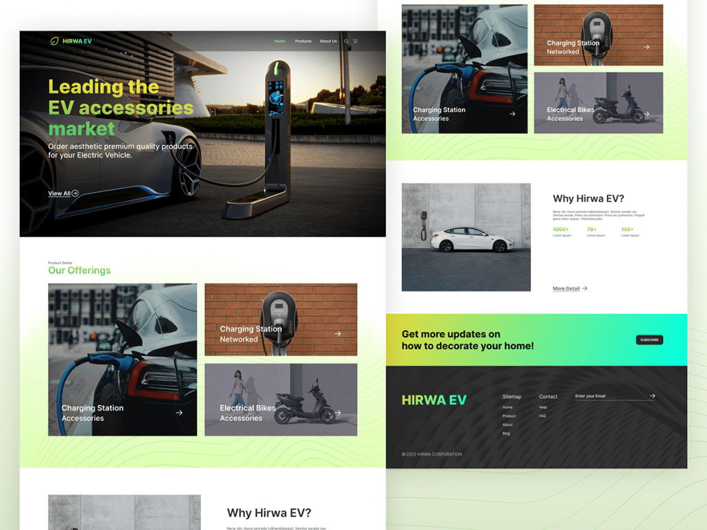
The conceptualization of the EV accessories website
The varied spectrum of the colour green was used to denote clean energy, green energy, etc.
The green colour was used with a palette effect. The palette started with a light shade and moved to a darker shade in all photographs. This particular colour scheme resembles the filling of a tank with green energy. It is a visual message to the website user about the fast movement of the industry.
The Hero image features a futuristic car.
A large Hero image was put at the top of the informative part of the page to simplify communication. A Hero image is an image that communicates the nature of the business or service of the firm in a nutshell. The Hero image focuses on a futuristic car from a perspective of a car owner who is recharging his futuristic-looking car.
The Hero image focuses on the futuristic car and the high-end technology gadget or accessory that is recharging the car. The image of the car is unmissable as the website user will look from left to right.
A wide range of EVs was shown to show the diverse capacity of the company when it comes to EV accessories.
The EV industry has made an impact but is still relatively young. According to research, a wide product range is an essential focus for the modern electric vehicle customer. The website features a wide range of electric vehicles, from scooters to futuristic cars. You should get the best Web Design Waltham.
The colour blue was used to denote high-end technology
The colour blue has always been very closely associated with technology. Deep blue, electric blue, and Cyan are the most predominant colours in the technology sector. According to research on the colour coding used by the top 100 technology firms, the colour blue in its various shades was a common factor.
More than 50 per cent of the top 100 technology companies had blue and or black in their brand logos. Blue has been a perennial choice in corporate branding and continues to be so. The blue tones got funkier and brightened as the technology sector emerged in its dominance—the conference halls and laboratories. The bright blue gel-like colours now represents cutting-edge, modern technology.
The colours blue and shades of green were combined in the Hero image to communicate the synergy between cutting-edge technology and clean energy vis-à-vis synergy with Mother Nature.
The combination of colours acts as a flag for product freshness and the unique combination of the EV industry. The gel-like blue, bright blue colour and the palette of different shades of green add a certain trendy zing to the website, which is also in sync with the trend of the EV industry. The contrasting background of the colours attests to the edgy, creative and confident thinking paradigm of the EV industry.
An image was also included to reassure the traditional change-resistant consumer. A traditional picture of a refuelled car was also used for the more tradition-minded consumer. The only change is that the EV was being charged and not refuelled.
The hit of a combination of bright colours to a solid base colour conveys this message. In one of the pictures, green (border), red (tail lamp of the car) and blue (charging unit) are used to create an attention-grabbing, vibrant image.
There is a concept of perceptual predisposition in product marketing. The tradition oriented, the change-resistant customer was also given something he is used to. This was done to reassure the change-resistant customer that the basics of the industry have not changed except its upgradation to clean energy and higher levels of elegance and sustainability.
The Hero image also features the open skies and a dash of greenery under it to communicate the closeness of the entire concept of EV with Mother Nature.
The Hero image also included treats for nature lovers who are also fond of cars with cutting-edge technology. The image also features a dash of green and open skies, which correlate the image with Mother Nature. The innovation is combined with sustainable transportation.
The Hero image also includes a call to action.
The nearest button, “View all”, for the range of products. After impressing the visitor with the image of the futuristic car, and the high-tech charging station, a view of all the products that are being offered is made available at the nearest click. The product range can also have individual buy buttons for a seamless call to action.
The end of the website seeks to engage customers.
It entices the website visitors with the promise of more information to decorate their homes. The clean energy concept is relatively new. According to research, consumers are hungry for information on sustainable energy. The page also offers information on a renewable energy future for homes. The website visitors will likely be upwardly mobile, progressive, cutting-edge technology lovers. Therefore, providing more information, options, products, solutions etc., based on sustainable energy is a worthy investment.
The critical question, “Why Hirwa EV” is both raised and answered on the website
In addition to menu items, the website also leads the visitor to an answer to a critical question that they might have as a potential consumer. The answer to the question, “Why a call to action also follows Hirwa EV”. The website tries to focus user intent on making the purchase decision. After a user explores the products, they are lead to the next logical step to make a purchase.
All the clicks lead to a Call to action and a payment gateway
The images and the clicks by the user all lead to a Call to action button
· ORDER YOURS
· NEW INVENTORY
· BUY NOW
· USED INVENTORY
· TEST DRIVE
The use of block capital Call to action makes it enticing and authoritative. They are also placed near an image where a user’s sense of enquiry for information will lead him to. The website uses strategically placed CTAs to optimize customer conversion.
UI/UX design is used to keep the customer engaged.
The window of opportunity for a website to make an impression on the customer is less than 4 seconds. This is why UI/UX design keeps the customer engaged. The UI/UX design is optimized for the customer profile of the EV industry. This leads to the websites retaining the visitor’s attention. This results in a high customer engagement and conversion ratio.
UI/UX website design based on our research in the EV Industry
The market research gets us a detailed customer profile. The brand message, the website’s communication, and the call to action are aligned to provide a single unified communication giving the customer every reason to choose HIRWA EV. The integration is possible due to the ground-up approach, which starts with market research.
Conclusion
The specific research-backed UI/UX design leads to increased customer engagement. Increased customer engagement leads to better conversion rates and more revenues. If the business is handled correctly, it will lead to greater profitability and higher returns on investment.